
Wednesday
Entertainment for Seagulls
Tuesday
Three Gray Inks Reviewed --- J. Herbin Gris Nuage, Noodler's Lexington Gray, Diamine Grey

I want a gray ink to use with watercolors, so I've spent the past two or three days testing several candidates. Each of the little sketches above was done with one ink, so I could start to get an idea of how they would perform when used with watercolors.
- J. Herbin Gris Nuage is a very light, silvery ink. It looks purplish in the bottle. If you want something to use with watercolor that leaves a very light line like a hard pencil, or to fill a brush for light midtone areas, this is the perfect ink for that.
- Noodler's Lexington Gray is my personal favorite so far. It's completely bulletproof, considerably darker than the Gris Nuage, and is not as blue-violet in color. It's a nice mid-to-dark value, so it's easy to see on the page. The lines are not as obvious as with dark black ink, so it has less of an outlined, coloring book look to it, and it allows the color to sing, since it doesn't overpower with value.
- Diamine Grey is highly washable. It's a nice color and value, but it washes so easily that I can't keep my lines. It mixes with the color and everything gets dirty.
Saturday
The Old Tioronda Hat Works Factory

Friday
Tioronda Falls Ink and Wash

9x12" across a two page spread in my Fabriano Venezia book
I'm still working on my ink and wash ideas. I did this with a Platinum Preppy fountain pen with a .5 nib and Private Reserve Velvet Black ink. I can't even say what a fun time it was doing this sketch! Going out for plein air work with just a sketchbook, pen, and waterbrush is extremely liberating! No easels, paints, brushes, solvents, and umbrellas to cart around. I could get used to this! I have a couple of technical issues that I need to resolve in terms of getting this medium to do what I want it to do, but each time I sketch with it, I learn something.
Monday
Breakfast Sketch with Color

I decided to take the plunge and go ahead and add watercolor over my ink and wash sketch from this morning. Am I ever glad I did! I think the color component takes it to a whole new level, without losing any of the impact of the original ink and wash, which remains visible through the transparent watercolor. Now I'm more excited than ever about pursuing this further, and taking it into the plein air realm as well. I think it might translate well to acrylic also, which could mean big canvases with lots of contrast and subtle coloration on the way later in the season as this develops.
If you'd like to see the initial ink and wash that this started with, or read a transcription of the full text, just scroll down to my post from this morning. If you're viewing this off my blog, you can click here instead.
Breakfast Sketch

Platinum Preppy .5 with Private Reserve Velvet Black
I purchased this Marilyn Price pitcher on Saturday night at RiverWinds Gallery. I put some flowers in it and set it on the breakfast table, knowing I'd be sketching or painting it (or both!) at the first opportunity. I'll probably do an oil painting of it this week too.
I'm looking forward to exploring more inks and refining my process with ink and wash. Once I feel I have a better grip on this medium, I'll do some on nice watercolor paper that I can offer for sale. Until that time, they'll only be posted here on my Sketches blog.
I don't know if you can see the subtle violets in that appear in the washes of this Velvet Black ink. If you saw it side by side with a traditional black, you'd see the difference for sure. I'm thinking about adding some red and yellow watercolor to this sketch. If I do, I'll post it again with the changes.
Saturday
New Inks to Play With, WooHoo!
I had 13 ink samples come in a couple of days ago:
Noodler's Nightshade
Noodler's Sequoia
Noodler's Walnut
Noodler's Navy
Noodler's Pecan
Noodler's Whaleman's Sepia
Noodler's Kung Te-Cheng
Noodler's Baystate Blue
Private Reserve Velvet Black
Private Reserve Avocado
Private Reserve Chocolat
Diamine Red Dragon
J. Herbin Rouge Hematite
I played with the samples on a sheet of an 11x14" Raffine sketchbook, since this paper is well sized to allow the ink to move with water. I was especially interested in seeing which ones would wash with a waterbrush, and for how long they'd retain that characteristic, and which ones stayed put.

The ones that washed the best and longest have small stars next to the name on the test sheet. I kept returning to the samples and going over parts of the writing with a waterbrush. The Noodler's Kung Te-Cheng is definitely Bulletproof. All of the others washed more than that one, with several contenders for ink and wash work.
The bottom row of inks is from the March Ink Drop from Goulet Pens. For those not familiar with the Ink Drop, you pay $10 a month, and each month five ink samples show up in your mailbox! You also get a 10% discount on full bottles of that month's inks, in case you fall in love with one of the samples. Other member discounts are also offered.
In addition to knowing how much the different inks wash, I am interested in finding out which ones are lightfast. I cut pieces of Strathmore 500 Plate Bristol for this. I know the ink sinks in a lot more on this; maybe it would have been better to do it on a different surface, but I'll see how this goes. Perhaps I will size the paper myself for the next batch.


A heavy line of the ink was drawn with a Q tip, going back and forth four times. Then I washed with a waterbrush to draw down some of the ink into a wash line below. I wrote the ink names in on each side with a bamboo dip pen, and the strips were cut in half. The left halves will go into a south facing window. The right halves will be stashed in a wooden box so they will not be exposed to light. I'll keep comparing them over time, and will add each month's Ink Drop samples to the test. I'll report back as I check on the samples being tested.
I've selected Noodler's Nightshade and Private Reserve Velvet Black to experiment with first for artwork, and have loaded up a couple of fountain pens from the samples. You can expect to see some of the results from those soon.
Around the Corner from Main Street
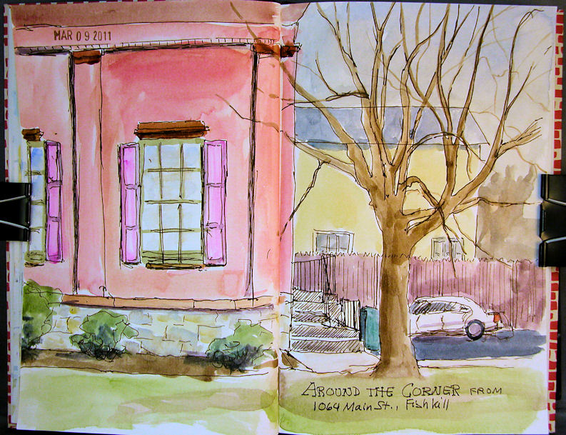
I went out to paint with my friend Virginia the other day. It was supposed to be 50 degrees and sunny, so we were pretty excited about having a nice day for some plein air work. Well, foiled again! It was freezing cold and overcast. We pulled off onto a side street where there was room to park, and did sketches from the warm comfort of our cars!
This is across a two page spread in my Fabriano Venezia book. It’s getting really difficult to keep this book opened fully enough to sketch and paint across the center. I might have to ditch it for a different journal. I love the paper, but this binding could be a dealbreaker. I’ve cut a piece of foamcore to the width of the open book, and I can clip each side of the journal to the foamcore back to keep it open. I’ll see if this works out over the long run, or if I’ll have to make a change.
I’m also starting to think that I should separate these sketches from my artwork for sale, and post them to a different blog. More on that if and when I get the other blog up and running!
Wednesday
Sketches from the WC WDE
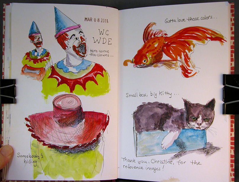
About 9x12 across a two page spread in my Fabriano Venezia journal.
Materials:
Lamy Safari EF fountain pen with Noodler's Bulletproof Black ink
Winsor Newton and Holbein watercolors
A teeeeeny bit of white gouache
Escoda sable brushes sizes 6 and 2
My husband was at a meeting last night, so I figured I'd do a little sketching. I went to the Wetcanvas website to check out the Weekend Drawing Event images, and they looked like a lot of fun! I sketched the first few that grabbed me looking at the computer screen. I did the sketches all in ink first, then went back and painted them with watercolor. Fun, fun.
Monday
Rondo on the Window Ledge
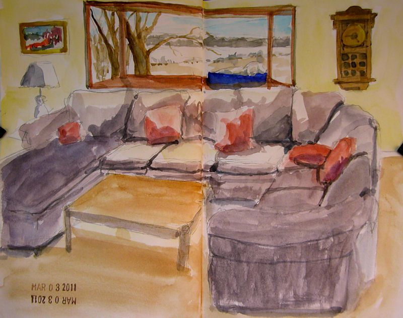
Click image for a clearer, larger picture.
Size is about 9×12, across a two-page spread in my Fabriano Venezia sketchbook.
My dog’s favorite spot is up on the bay window in the living room, where he can survey his kingdom. He can see all the way across the lake, as well as up the driveway. Best of all, it’s near the kitchen, where he never misses an opportunity to sucker somebody into feeding him.
This was done with my little 24-color Koi set and a single waterbrush that comes with the set. I am hoping to do more plein air sketches this year, and this is probably the most convenient way to do it, so I’m practicing. However, I miss the color saturation of my artist grade watercolors.
Wednesday
Sketching Along the Hudson River
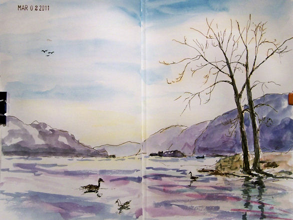
About 9×12″
Ink and watercolor in my stitch-bound, Fabriano Venezia book
Ink and watercolor in my stitch-bound, Fabriano Venezia book
I heard it was going to be 51 degrees and sunny today, so I packed a big smile and headed out the the Newburg waterfront along the Hudson River to paint with my friend Virginia Donovan. Clearly the weather forecast was merely a trick played on me by the weatherman to get me to give up the comfort of my warm studio. In addition to colder-than-forecasted temperatures, there was a stiff wind blowing.
I thought about painting from my car, but I much preferred the downriver view, which wasn’t visible from the parking lot. Determined to work outside, I donned a heavy coat, hat, and fingerless gloves. I figured I could at least make it through a sketch or two. This one began with a Lamy Safari fountain pen with an EF nib and Noodler’s #41 Brown ink. Once I got the elements placed and the trees drawn, I broke out a waterbrush and a Sakura Koi 24 pan watercolor set.
I was accompanied by some adorable seagulls and the honking of Canadian Geese. There were still large chunks of ice floating by in the river. By the time I finished the sketch, I was feeling pretty warm. I started a small painting which I’ll have to finish in the studio, since we decided to break and go out for lunch. The afternoon was overcast and there were snow flurries on the way home! Nevertheless, it really felt great to get out and do a little plein air work again.
I’ve been doing a lot of sketching lately, though I haven’t been posting most of them. I always feel that things should be displayed in a more “finished” state than what I generally do in a sketch, but lately a lot of people have commented that they love seeing the sketches. If you have an opinion about this, please let me know. One thought I’ve had is to create a second blog and post just the sketches there; then those who are interested in seeing only finished pieces wouldn’t have to subscribe, and those who want to see the sketches can see them on the other site.
Friday
Square Sketches
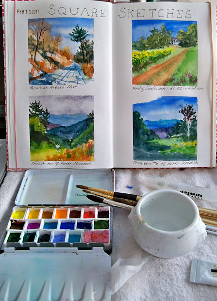
I haven’t been able to let go of my Fabriano Venezia book yet! There are a number of photos I’m considering working into square format paintings. I decided to test drive some of those compositional ideas as watercolor sketches today.
Here is a photo with my setup. I used a little squirrel mop travel brush for the wash stages on all four sketches, and then dried the pages with a hair dryer. Then I went back with Escoda sables to finish them.
Below is a clickable photo that will show a larger, clearer image when you click on it:
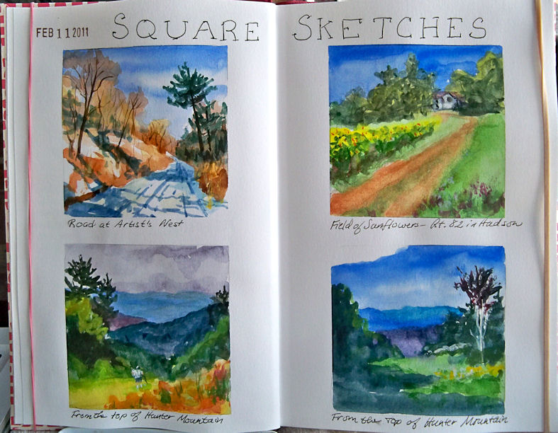
Soon I’ll have to make the difficult choice of which one to do first as an oil or acrylic painting on a panel. Anybody have a favorite?
Thursday
Fabriano Venezia Sketchbook Journal
I recently got this Fabriano Venezia journal and have been looking forward to dipping into it. New journals are always a little intimidating until a few pages are underway. The nicer the paper, the harder it is to get started in them! Leaving the first page blank often helps, so I skipped over that one and filled the next two pages with some watercolor sketches.
This journal is stitch bound, with very thick pages that take ink and watercolor quite well. I’m impressed with it so far, and looking forward to trying some other mediums with it, though I suspect it will remain mostly an ink/watercolor journal. It is currently at the top of my “favorite journals” list! One negative thing worth noting is that the journal does not open as flat as a Moleskine does. It’s so easy to draw/paint across two pages on the Moleskines; not so much on this one.
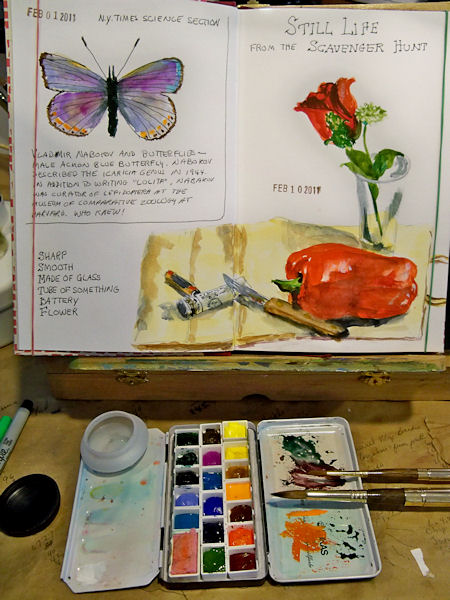
In the photo above, you can see my little half pan box. This is actually only supposed to contain 12 half pans, with the center section empty for a travel brush, but I reconfigured it with 18 half pans and a whole pan that holds my little piece of sponge. When doing these quick sketches, I like having lots of colors. The two brushes shown are Escoda sable travel brushes. They come apart and the brush can go inside the gold sleeve, protecting it for travel. Last time I traveled with them though, they drove the security people crazy on the Xray machine!
Here’s an image that you can click on to enlarge it and see the pages better:
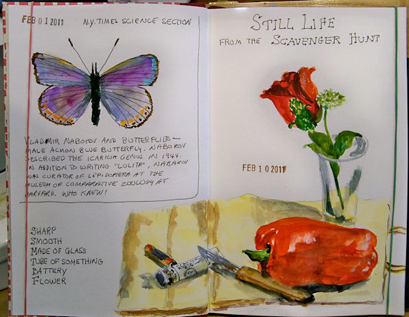
The butterfly was sketched from a New York Times article on Bladimir Nabakov’s butterfly research, and the little still life is from a sketching Scavenger Hunt posted to the Artwork from Life forum on Wetcanvas.
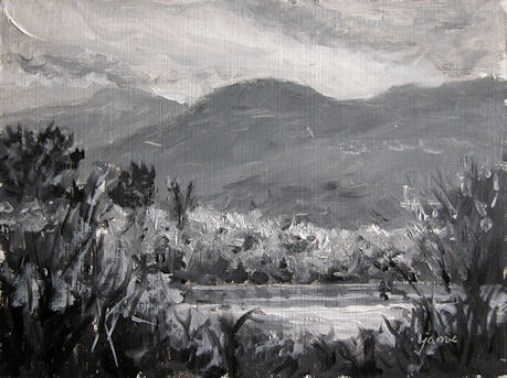
Painting Shades of Gray in Devil's Kitchen
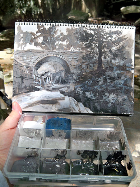
I went back to Devil’s Kitchen in Platte Clove, this time to capture some of the strong contrasts in the morning light. Remember this little container, filled with Golden’s Neutral Gray Heavy Body Acrylics? The lid supports my Shades of Gray watercolor sketchbook, and having the premixed shades and tints has turned value sketching from a chore into one of my favorite ways to paint.
Here’s a picture of just the sketch. You can click it to enlarge it. The actual size is about 6×9″.
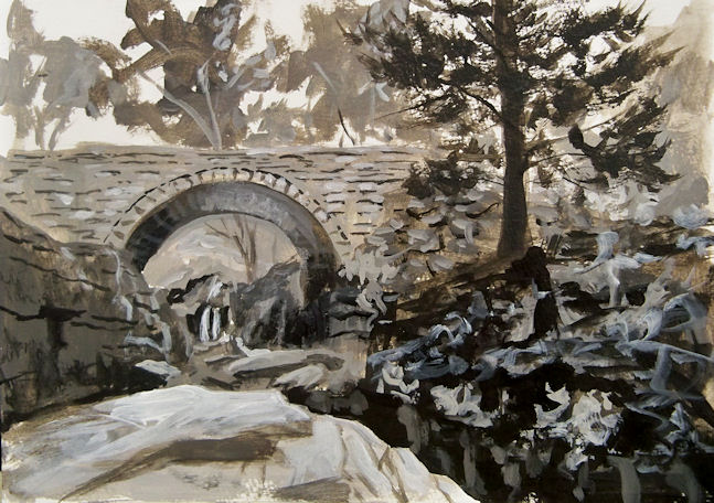
The deep chasm in the right foreground is called Hell’s Hole. My goal was to take the viewer along that chasm and under the bridge, to the waterfall beyond. Although I’d not planned to do a color version of this scene, now that I’ve seen it in black and white, I really want to go back and do it again in color.
If you click here, you can see this bridge painted in oils from the other side on my Hudson Valley Painter site!
Wednesday
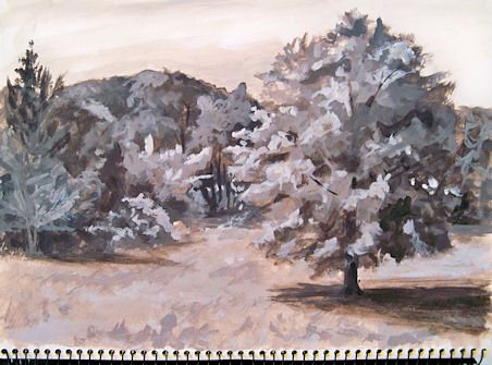
Road Beside the Red Barns --- Monochrome Value Study
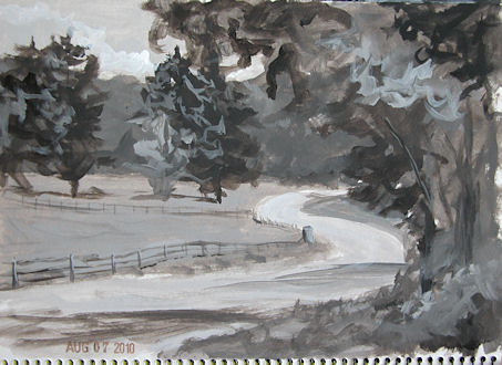
This is another entry in my Shades of Gray, monochrome value study book. It was painted en plein air while out sketching with my friend Karen the other day. I’d already done the full color sketch of the red barns (which I posted a couple of days ago), and was waiting for Karen to finish up her painting. That was the perfect opportunity to pull out my container with the acrylic values already laid out and look for a second composition. I loved this curvy road going off into the distance, and it presented me with a wide range of values to work with.
Monday
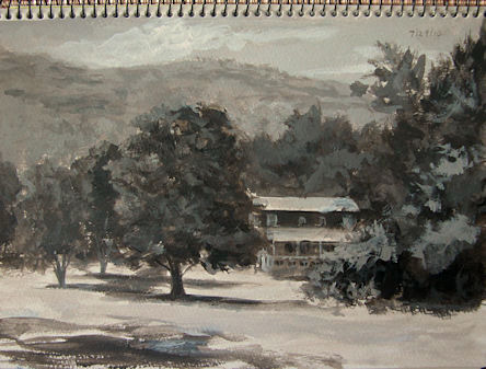
Sketching Barns
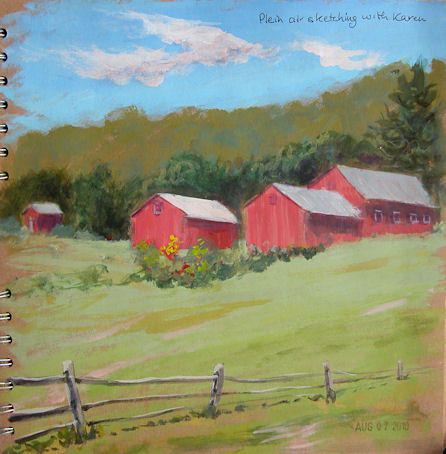
I went out painting with my friend Karen on Friday, and decided to do some sketches rather than a focused effort on a single painting. This was my first sketch of the day — beautiful barns up on the hillside that we’d been admiring on our painting outings for quite some time. This one was done with Golden Fluid Acrylics in my 10×10″ Kraft paper sketchbook.
Friday
Painting Black and White Oils
6×8″, Oils on sealed, primed hardboard
Email me at JamieWG@aol.com if interested in this painting.
Email me at JamieWG@aol.com if interested in this painting.
The little monochrome painting above was done at a pond up the road from me that has wonderful mountain views. I asked for permission to park and paint there, and the gentleman in the driveway said that his wife was also an artist, and that I should go knock on her studio door and say hi! Well, I did that and made another new artist friend in the area! It turns out that she will be in a show with me next weekend. Such a small world! Her studio overlooks this dramatic view, and she had an especially beautiful winter scene that she’d done from the window.
I used the opportunity to do a monochrome painting, then a limited palette painting. I’ll go back again and do a full color version.
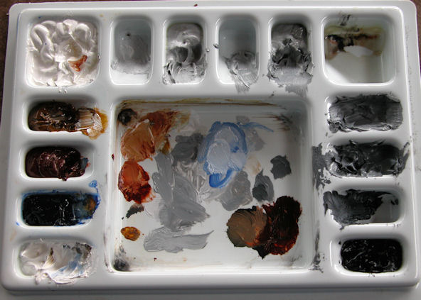
In addition to the value paintings I’ve been doing in acrylic, I have an oil painting setup to do monochrome studies easily and quickly in oils. I use the Judson’s Guerrilla Painter 6×8 watercolor box, Gamblin Light, Medium and Dark Portland Grays, plus Ivory Black and Titanium White. I also keep three colors in here for limited palette studies: Transparent Yellow Oxide, Transparent Red Oxide and Ultramarine Blue. (You can click this image to enlarge it a bit.) It has a cover, and fits right inside my 6×8″ Guerrilla pochade box.
Thursday
Painting Monochrome at Home --- Shades of Gray Number 3
Golden Neutral Gray Heavy Body Acrylics in a watercolor sketchbook
I’m starting to really love doing these monochrome studies. They are such wonderful practice for improving the way we see values. Having the pre-mixed Neutral Grays has made all the difference in the world, and has turned this from a tedious chore into a fascinating adventure.
I sat outside in the yard in a comfortable chair after standing up and painting all morning, and painted this study under the shade of my favorite tree, with a cool breeze blowing.
Monday
Monochrome Morning in the Back Yard
Continuing on with my monochrome value studies in acrylics, this one was added to my Shades of Gray sketchbook this morning. This was also done with the Golden Neutral Gray acrylics plus black and white. I think I’m starting to really enjoy these, much to my surprise!
Tuesday
Shades of Gray --- An Approach to Value Studies
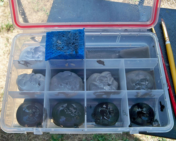
I set out Golden Heavy Body Acrylic Titanium White, Carbon Black, and all the Neutral Grays in between that Golden makes in a plastic container with compartments and a seal. Value studies are so important, but premixing all those grays ahead of time can be cumbersome enough to put it off time and time again. Now I have no excuses, and this container makes it so easy to pop the lid and paint at a moment’s notice.

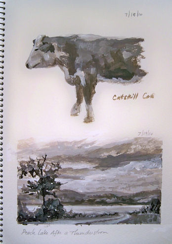
This book is about 6×9″. I’m reserving it for my value studies in acrylic, and have dubbed it “Shades of Gray”.
Here’s the first page. The cow was painted from a photo I took on Friday. The little landscape was painted here by the lakeshore this morning.
Subscribe to:
Posts (Atom)